Let’s face it: people judge a book by its cover, so your book cover has to really wow a reader.
This is what drives many people to pay an artist hundreds of
dollars to do a fantasy book cover for them.
For most of us, cover art is something we will have to hire
out for. We’re writers; that doesn’t mean we’re graphic artists. “Don’t quit
your day job.” It’s okay to NOT be a graphic artist. If you don’t have the
skills necessary to produce a professional-looking book cover, then you’ll need
to get in touch with a freelance cover artist. But you don’t have to break the bank
to get a good cover, the key is finding the right artist to work with.
The “right” artist is not always the most expensive one,
either. Remember that! What makes an artist “right” in my opinion, has more to
do with vision than with price. Now, don’t get me wrong, an artist needs to be
good at what they do, but first and foremost, they need to share your vision,
or have a good one of their own that meshes with your book.
If you and your artist mesh well, that’s when the magic
happens.
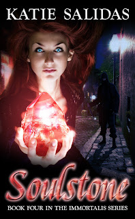
Let’s take a look at my latest release, Soulstone for example.
I’m going to run you through the process from beginning to end, and as a bonus,
I’ve got Willsin Rowe (the graphic artist who created this book cover) here as well to give
you the “artist perspective” as well.
I had a simple idea of what I wanted for my cover: A girl to
represent Alyssa (my main character) and a mystical stone. I took this idea to
my trusty friend and book cover artist Willsin Rowe of
Coverage. Here was the picture I initially purchased to use
from Istockphoto.com
Now, as I said before, a good book cover artist not only needs to
be good at what they do, but they need to be able to work with your vision.
Willsin could just have taken this picture and re-colored the hair (my main
character is a redhead) and add the title, then send me on my merry way. But he
didn’t do that. He knew this was not enough to really make a stellar cover.
(pride in their work is a sign of a good artist) What can I say, Willsin’s good
for a reason!
Well, that’s very kind, milady. Any cover artist worth
their salt wants to produce artworks that please themselves as well as their
client. That can sometimes become difficult. It’s always tempting to throw
every little trick you know at a cover, just to show what you have in your
armory. But of course, that’s much like a writer throwing every word they know
into a story. It’s not automatically wrong...but it usually is! So apart from
having an “eye” and technical ability, one of the most important tools a cover
artist needs to have (or learn) is empathy. The cover
might be the artist’s creation, but it should never be anything more than a
pretty outfit for the author’s baby.
Willsin immediately began suggesting other alterations we
could make to really give this cover some oomph. That’s one of the things I
really appreciate about working with Willsin. He dives right in with suggestions
and not only that, he takes time as well to find the right images to add on to
the picture. This often amounts to hours of searching online through the
various royalty-free stock photo sites.
I was looking for two main elements: a convincing crystal
to represent the Soulstone; and a background in which to set the mini-story
that this cover needed to be.
Through close and constant back-and-forth consultation
Katie and I settled on these two images. I loved the crystal right away because
of the combination of crisply cut facets and natural roughness. To me, that
factor hinted at it being more than one thing: in this case, a crystal and a
prison for Lysander’s soul. And since the story opens in Boston (where
“Pandora’s Box” left off), we chose to use Acorn Street, a 19th Century lane in
Boston, for the setting.
Once we agreed on a few different photos to add to the
original image he began to place them in various spots. The girl was cut and
moved around. The crystal was changed to better match the description in the
book. The background was changed, flipped around, and recolored. Then, text was
added. Layer after layer the cover began to take shape.
But still it wasn’t “right.” And that wasn’t just my
feeling. Willsin too felt that while we were close, we still had not captured
the right layout or text.
Remember, cover art is more than just pretty pictures
slapped together. The text has quite a bit to do with it as well. I’ve spoken
before on cover art, layout, and text placement.
A small review: Things to consider with fonts
1). Organize size of fonts in order of importance.
The title of the book should be the largest font on the
cover. (At least until you’re Stephen King.) Author name should be smaller, but
still prominent. Any subsequent text or quotes you wish to add should continue
to be smaller in size.
2) Select the color of fonts to stand out, yet still feel
like it belongs.
3) Organize the placement of fonts to work with the artwork,
not against it.
Don’t cover up beautiful artwork with your words. Yes, some
things will get covered, but you should not plaster a title across the best
part of the picture.
4) Don’t clutter the cover with text.
Only text that is absolutely necessary should be there.
Quotes are nice, but limit it to one on the cover. Use your interior pages for
continued praise of the book.
5) Pick fonts that are striking and bold enough to be seen
in both large and small sizes.
You have to account for the people who might pick you up on
a store shelf as well as those browsing the virtual racks.
This is where the author/artist relationship really gets
tested. When a cover gets to the point of almost done, it’s those little tiny
tweaks that really make the difference.
As you can see, sometimes those tweaks can be as tiny as
moving text around, or as big as placing a character in the background.
Sometimes it’s the background. Notice the various blurring effects used and the
slight changes in the colors. All of these little changes amount to quite a bit
of work for the artist, and some artists may not have the patience. Sure, they
all look good on their own, but to get “just right” is the marriage of art and
vision and again, finding that cover artist who can work with you makes that
extra bit of difference.
I absolutely agree with all of the above there. The
points about type are spot on. I really can’t add anything to that. And the
tiny tweaks can really make a strong difference.
As an example, I thought I’d waffle on a little about the Soulstone itself, and give a demonstration of the complexity that can often
occur with a cover.
Firstly, here is a section of the original image, as
placed on the cover.
Now, obviously, the crystal ball was never gonna work!
Which is why we sought out that groovy crystal image. (You can see here that I
had to clone some of Alyssa’s clothing over the right side of the ball, in
order to stop it showing behind the overlaid crystal).
Next, I placed the crystal image over the top, ensuring
that it ran the exact width of the crystal ball. I used a Layer Mask to remove
the white background.
The next step: where the heck is her hand? So I had to
apply a second mask which hid any parts of the crystal which were running over
Alyssa’s hand. Like so:
Now the crystal is looking basically as though it’s
really sitting in her hand, which is of course the desired effect. But though
it has those lovely dull gold and dark lilac tones, it still doesn’t give the
impression that it contains the disembodied soul of a 2,000-year-old vampire.
So the next step is to infuse the crystal with life and a sense of magic. The
first part of that step, is to give it a rich blood-red tone.
This was done with a simple layer of a rich red color, to
which I assigned a Color Burn effect, which allowed the textures of the crystal
to show through.
To increase the sense of depth, I then gave the crystal a
darker hue at the bottom.
So now we have a blood-red crystal. That’s a good start.
But it still has no life. So I slipped a white glow into the layers, between
the crystal and the blood-red tone, giving the following effect.
So now it has depth and life. But what about the magic?
Well, you know what they say...it’s all smoke and mirrors! Well, in this case,
it’s all smoke! I placed a layer of smoke over the image and gave it the right
amount of opacity, as well as keeping the color tone in the right family of
red. Like so...
Then I duplicated it over itself, and blurred the top
layer. Like this:
And lastly, if this stone is a-glowin’, then we need for
that glow to affect the elements in the general area. In this case, Alyssa. So
I placed a red glow over the top of the entire kit and caboodle, and voila!
So there you have it. Nine layers of Photoshoppy
goodness, to make one magical crystal prison.
As you can clearly see, if you and your artist are in tune
with the vision for the cover you can make magic happen!
It means the difference between this:
And this...
So, as I’ve said before, do your homework, find an artist
who not only fits your budget, but more importantly your vision, and you will
end up with a stunning cover that will wow your readers and draw attention to
your book.
If you’re interested in hiring Willsin Rowe of Coverage
for your next book, click the here!
And if you’d like more Self-Publishing advice, please check
out Go
Publish Yourself! (Available in print and ebook) It’s a handy dandy little
guide to help you on the path of Self-Publishing success!


